Basic settings ReactJS
Note: these guidelines assume that you have basic knowledge of Web Development and that you have previously installed nodeJs on your computer.
Create a new React project
npx create-react-app bunny-widget-integration
cd my-app
npm start
Intall dependencies
npm install --save react-router-dom
add basic styles
bunny-widget-integration/src/App.css
/* Global Styles */
:root {
  --primary-color: #17a2b8;
  --dark-color: #343a40;
  --light-color: #f4f4f4;
  --danger-color: #dc3545;
  --success-color: #28a745;
}

* {
  box-sizing: border-box;
  margin: 0;
  padding: 0;
}

body {
  font-family: 'Raleway', sans-serif;
  font-size: 1rem;
  line-height: 1.6;
  background-color: #fff;
  color: #333;
}

a {
  color: var(--primary-color);
  text-decoration: none;
}

ul {
  list-style: none;
}

img {
  width: 100%;
}

/* Utilities */
.container {
  max-width: 68rem;
  margin: auto;
  overflow: hidden;
  padding: 0 2rem;
  margin-top: 6rem;
  margin-bottom: 3rem;
}
/* Text Styles*/
.x-large {
  font-size: 4rem;
  line-height: 1.2;
  margin-bottom: 1rem;
}

.large {
  font-size: 3rem;
  line-height: 1.2;
  margin-bottom: 1rem;
}

.lead {
  font-size: 1.5rem;
  margin-bottom: 1rem;
}

.text-center {
  text-align: center;
}

.text-primary {
  color: var(--primary-color);
}

.text-dark {
  color: var(--dark-color);
}

/* Padding */
.p {
  padding: 0.5rem;
}
.p-1 {
  padding: 1rem;
}
.p-2 {
  padding: 2rem;
}
.p-3 {
  padding: 3rem;
}
.py {
  padding: 0.5rem 0;
}
.py-1 {
  padding: 1rem 0;
}
.py-2 {
  padding: 2rem 0;
}
.py-3 {
  padding: 3rem 0;
}

/* Margin */
.m {
  margin: 0.5rem;
}
.m-1 {
  margin: 1rem;
}
.m-2 {
  margin: 2rem;
}
.m-3 {
  margin: 3rem;
}
.my {
  margin: 0.5rem 0;
}
.my-1 {
  margin: 1rem 0;
}
.my-2 {
  margin: 2rem 0;
}
.my-3 {
  margin: 3rem 0;
}

.btn {
  display: inline-block;
  background: var(--light-color);
  color: #333;
  padding: 0.4rem 1.3rem;
  font-size: 1rem;
  border: none;
  cursor: pointer;
  margin-right: 0.5rem;
  transition: opacity 0.2s ease-in;
  outline: none;
}

.badge {
  font-size: 0.8rem;
  padding: 0.1rem;
  text-align: center;
  margin: 0.3rem;
  background: var(--light-color);
  color: #333;
}

.alert {
  padding: 0.8rem;
  margin: 1rem 0;
  opacity: 0.9;
  background: var(--light-color);
  color: #333;
}

.btn-primary,
.bg-primary,
.badge-primary,
.alert-primary {
  background: var(--primary-color);
  color: #fff;
}

.btn-light,
.bg-light,
.badge-light,
.alert-light {
  background: var(--light-color);
  color: #333;
}

.btn-dark,
.bg-dark,
.badge-dark,
.alert-dark {
  background: var(--dark-color);
  color: #fff;
}

.btn-danger,
.bg-danger,
.badge-danger,
.alert-danger {
  background: var(--danger-color);
  color: #fff;
}

.btn-success,
.bg-success,
.badge-success,
.alert-success {
  background: var(--success-color);
  color: #fff;
}

.btn-white,
.bg-white,
.badge-white,
.alert-white {
  background: #fff;
  color: #333;
  border: #ccc solid 1px;
}

.btn:hover {
  opacity: 0.8;
}

.bg-light,
.badge-light {
  border: #ccc solid 1px;
}

.round-img {
  border-radius: 50%;
}

.line {
  height: 1px;
  background: #ccc;
  margin: 1.5rem 0;
}

/* Overlay */
.dark-overlay {
  background-color: rgba(0, 0, 0, 0.7);
  position: absolute;
  top: 0;
  left: 0;
  width: 100%;
  height: 100%;
}

/* Forms */
.form .form-group {
  margin: 1.2rem 0;
}

.form .form-text {
  display: block;
  margin-top: 0.3rem;
  color: #888;
}

.form input[type='text'],
.form input[type='email'],
.form input[type='password'],
.form input[type='date'],
.form select,
.form textarea {
  display: block;
  width: 100%;
  padding: 0.4rem;
  font-size: 1.2rem;
  border: 1px solid #ccc;
}

.form input[type='submit'],
button {
  font: inherit;
}

/* Navbar */
.navbar {
  display: flex;
  justify-content: space-between;
  align-items: center;
  padding: 0.7rem 2rem;
  position: fixed;
  z-index: 1;
  width: 100%;
  top: 0;
  border-bottom: solid 1px var(--primary-color);
  opacity: 0.9;
}

.navbar ul {
  display: flex;
}

.navbar a {
  color: #fff;
  padding: 0.45rem;
  margin: 0 0.25rem;
}

.mt-1{
  margin-top: 1rem;
}

.navbar a:hover {
  color: var(--primary-color);
}

.navbar .welcome span {
  margin-right: 0.6rem;
}
.home{
  font-size: 1.5rem;
  font-weight: 300;
}
/* Landing Page */
.landing {
  position: relative;
  background: black;
  height: 100vh;
}

.landing-inner {
  color: #fff;
  height: 100%;
  width: 80%;
  margin: auto;
  display: flex;
  flex-direction: column;
  align-items: center;
  justify-content: center;
  text-align: center;
}

/* Profiles Page */
.profile {
  display: grid;
  grid-template-columns: 2fr 4fr 2fr;
  align-items: center;
  grid-gap: 2rem;
  padding: 1rem;
  line-height: 1.8;
  margin-bottom: 1rem;
}

/* Mobile Styles */
@media (max-width: 700px) {
  .container {
    margin-top: 8rem;
  }

  .hide-sm {
    display: none;
  }

  /* Text Styles */
  .x-large {
    font-size: 3rem;
  }

  .large {
    font-size: 2rem;
  }

  .lead {
    font-size: 1rem;
  }

  /* Navbar */
  .navbar {
    display: block;
    text-align: center;
  }

  .navbar ul {
    text-align: center;
    justify-content: center;
  }

  .navbar h1 {
    margin-bottom: 1rem;
  }

  .navbar .welcome {
    display: none;
  }

  /* Profiles Page */
  .profile {
    grid-template-columns: 1fr;
    text-align: center;
  }

  .profile ul {
    display: none;
  }

  /* Profile Page */

  .profile-top img,
  .profile img {
    width: 200px;
    margin: auto;
  }

  .profile-grid {
    grid-template-areas:
      'top'
      'about'
      'exp'
      'edu'
      'github';
  }

  .profile-about .skills {
    flex-direction: column;
  }

  .dash-buttons a {
    display: block;
    width: 100%;
    margin-bottom: 0.2rem;
  }

  .post {
    grid-template-columns: 1fr;
  }
  .post a,
  .post button {
    padding: 0.3rem 0.4rem;
  }
}
Edit the App.js file
bunny-widget-integration/src/App.js
import './App.css';
import {BrowserRouter as Router, Route, Routes } from 'react-router-dom'

const App = () => {
  return (
    <>
      <Router>
        <Routes>
          <Route exact path="/" element={ <Landing />} />
        </Routes>
      </Router>
    </>
  );
}
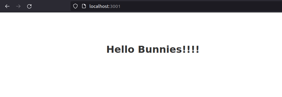
Run the project
npm start
You should get something like this